A Simple Strategy for Investing in the US Energy Boom
“There are no dry holes,” the man said. “Every well produces good oil and pays for itself.”
That’s what I learned during a talk with an oil company executive not long ago. The man’s operations are mostly in the Eagle Ford play of south Texas. He told me that just a few years ago, his first well cost nearly $30 million to drill and complete, over almost 60 days.
Now, with multiwell drill pads and reusing everything from rig roads to fracking water, his average cost per well is under $6 million; and drilling takes about seven days, with another seven days for completion. Savings go straight to the bottom line and dramatically improve the economics of every well.
So how does this affect your investing outlook? Let’s dig in.
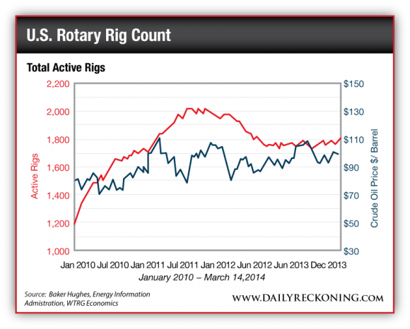
Now, because everything is connected to everything else, developments in one sector affect investments in another. For example, not long ago, a chart graphing out the number of active rotary drilling rigs in the U.S. over the past four years caught my eye. Here we see the number of rigs compared to average oil prices over the same time (the finer line):
As you can see, the number of active rigs rose fast starting in late 2009, during the post-crash oil patch recovery. Generally, the pace of U.S. drilling increased along with a rise in oil prices, from the $70-80 per barrel range to the current $100 per barrel zone.
As the chart shows, in 2012, the number of active rigs peaked and then declined to the current plateau (just under 1,800) over the past year. Within this rig count number, there are more rigs drilling for oil, the price for which has been rising, and fewer rigs drilling for natural gas, the price of which has been relatively low.
The rig count decline also reflects increased efficiency of drilling operations, particularly with horizontal and fracking plays. Using current technology and overall knowledge available in the field, a well-run rig can drill significantly more wells with more efficiency than in the past. This is NOT your father’s oil patch anymore. Today, things operate under an entirely different development model.
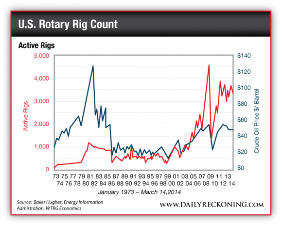
Let’s look at a similar chart, covering a much longer period of time. It’s the rig count going back to 1973, along with a chart of oil prices over the same time frame. Notice how the rig count from the first chart (above) is reflected on the far right side of this next chart:
 Production (as measured by rig count) follows prices over time.
You can also see within the second chart reflections of other important global issues. First, note the dramatic U.S. rig count spike in the late 1970s in response to a substantial oil price increase at the time. Back then, world oil prices shot upward due to loss of over 3 million barrels per day of global oil supply when Iranian exports broke down after the Iranian Revolution.
By 1985, however, the U.S. rig count crashed to below 1,000 as oil prices settled downward and traded in a relatively low range during the remainder of the 1980s and into the early 1990s. Those were also years when large volumes of new oil supply came online from places like Alaska, the North Sea, Angola and other locales.
After 2000, oil prices rose along with demand from the fast-growing Chinese economy. In fact, Chinese oil demand exceeded that nation’s production by a long shot and triggered a long oil price rise, eventually fueled even more by financial speculation.
As the chart shows, oil prices rose over the next eight years and eventually spiked at over $147 per barrel in 2008. This energy-financial distortion had much to do with the ensuing global economic crash — although the U.S. and global housing boom was another key element. On those lines, it’s fair to say that rising energy costs pushed many a household over the financial edge. As I noted at the outset, things are connected to each other.
It’s no coincidence that post crash, the U.S. Federal Reserve flooded the world with liquidity in the form of “quantitative easing” (QE). All that money had to go somewhere, of course, and to be sure, much of it went to bail out banks and prop up the stock market. That was the Fed idea.
However, other floods of QE liquidity hit the oil patch and funded a leasing and drilling boom that has delivered significant new amounts of energy to the U.S. economy.
In the aftermath of the 2008 crash and during the recovery that followed, the U.S. energy industry began to shift more and more assets and capital to directional drilling and fracking in “tight” rocks, particularly shale formations. In other words, the technological nature of the U.S. onshore drilling industry changed in a big way coming out of the 2008 crash.
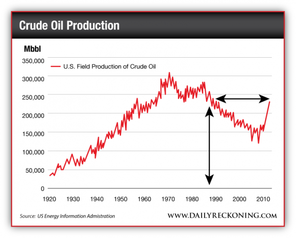
It’s a story that has yet to be fully researched and written, although we can see the broad idea reflected in oil output charts such as this:
As the oil chart (above) makes clear, for many decades, U.S. oil output followed the classic “Hubbert curve” of Peak Oil fame.
But by 2008 and afterward, with the tech revolution and “shale gale” in full gear, U.S. output began to move up sharply. New tech — coupled with significant infusions of capital — changed the shape of the Hubbert curve, and now the U.S. produces as much oil as it did back in the late 1980s, with more to come in future years.
So what’s the takeaway?
Well, consider that every barrel of domestic U.S. oil output displaces an imported barrel, so the effect is twofold, if not more. That is, every “new” U.S. barrel is wealth created in country, at about, say, $100 per pop. Plus, each new domestic barrel displaces an imported barrel, which leads to $100 less leaving the U.S. as part of the trade deficit.
Consider also that over the past three years or so, more and more barrels per day of “new” U.S. oil go through refineries and then get exported as product. In a very basic sense, U.S. refiners buy a $100 barrel of crude and export $200 of product. Again, it benefits the U.S. domestic economy and the trade economics of the country.
In fact, the benefits of increased U.S. oil production have been great enough to partially offset the decline in the dollar caused by the Federal Reserve’s QE policies in the first place. Given how much this influx of oil and gas has strengthened the U.S. economy, despite the banking crisis and its fallout, it’s no wonder that in recent years the U.S. dollar strengthened — and given the dollar’s natural relationship with precious metals, prices for the gold declined.
It gets back to the idea that everything is connected to everything else. Oil relates to money and that energy-money dynamic influences the price of gold. What does this mean for you, the resource investor? It means in some respects the two sides of our investing sphere, energy and metals, are counter-balanced.
And in this case when one side of the resource sector declines, we can expect the other to rise. Meanwhile you can count on us to keep you one step ahead of the market.
Regards,
Byron King
for The Daily Reckoning
P.S. There’s another part to the story you’ve probably missed. In today’s email edition of the Daily Reckoning, two of my colleagues, Peter Coyne and Paul Mampilly wrote about the Fed’s easy money… what’s driving the current depression… a yield stock that investors are confusing for a growth stock… and much more. If you haven’t subscribed to get the Daily Reckoning each day by email, you’re cheating yourself out of 50% of our free insights. Click here now to subscribe for FREE.


Comments: